Take a look at some of the templates I use for my clients.
Each template is carefully crafted with CTAs placed in just the right spots to guide visitors toward taking action.
Feel free to take inspiration, and if you’re ready to bring your vision to life, let’s connect and make it happen!
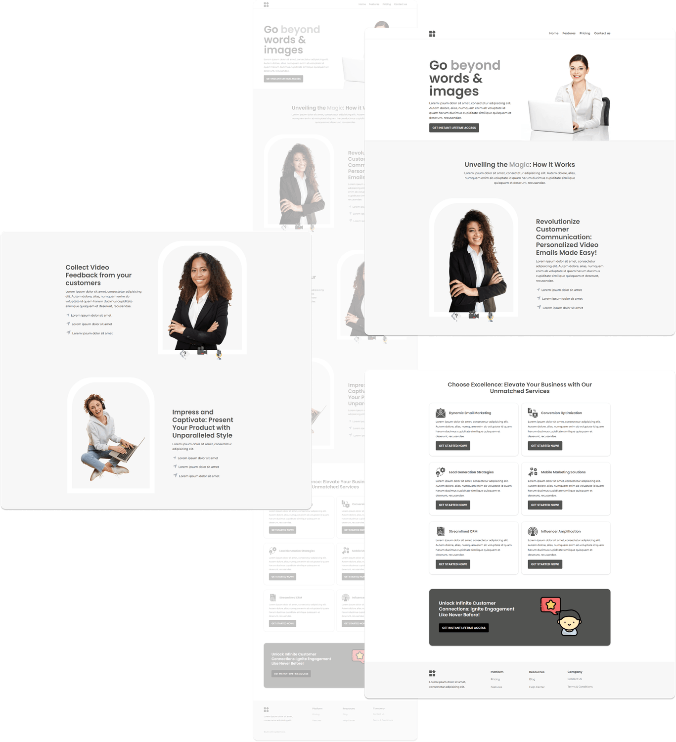
This website showcases a clean and minimalistic design inspired by the client’s vision and color palette of black, white, and gray. The simplicity of the layout makes it visually appealing while ensuring usability.
Automation Buttons:
• Interactive elements redirect users to targeted landing pages, enhancing navigation and user engagement.
Lead Magnet and Opt-In Section:
• Strategically placed at the bottom of the page, this section encourages visitors to subscribe, helping build an email list effectively.
Strategic Use of Imagery:
• Carefully selected images enhance the website's appeal while aligning with the brand message.
Services and Offer Highlights:
• The site prominently displays its services and unique offers, emphasizing how they provide value and solve customer problems.
Compelling Headline:
• A bold, attention-grabbing headline immediately engages visitors, sparking their interest and encouraging them to explore further.
This streamlined and strategic design ensures a seamless user experience while effectively promoting the brand's objectives.
The integration of automation and lead generation features makes it a powerful tool for driving conversions.
This website combines functionality and aesthetics with its yellow and black color accents, creating a modern and engaging design.
Call-to-Action (CTA) Buttons:
• Strategically placed CTAs guide users through the website, encouraging actions like inquiries, subscriptions, or property exploration.
Color Scheme and Typography:
• The primary colors are yellow and black, with black fonts used throughout for a clean and professional look.
Testimonials with Photos:
• Genuine customer testimonials, accompanied by pictures, build trust and credibility, highlighting positive experiences.
Lead Magnet in the Second Section:
• A dedicated section encourages visitors to subscribe or take advantage of an offer, helping to grow the email list.
Property Collection:
• A comprehensive gallery of available houses lets visitors browse and select properties. Directly below this, an inquiry form enables users to express their interest easily.
Above-the-Fold Attraction:
• A stunning hero image of a featured property captures attention immediately, inviting visitors to explore further.
Section Design and Layout:
• The overall layout uses a clean, white background for most sections, ensuring clarity and focus. The bottom section features a light gre
This well-structured website effectively blends engaging visuals, functional design, and persuasive elements, making it a powerful tool for showcasing properties and converting leads.


This website exudes elegance and sophistication, combining a carefully chosen color palette and visually captivating elements to attract and engage visitors.
Above-the-Fold Attraction:
• The hero section showcases a gorgeous, modern house, immediately capturing attention and setting the tone for the site.
Color Palette and Visuals:
• The design incorporates warm brown tones for buttons and visuals, creating a cohesive and inviting atmosphere. Indoor examples are carefully selected to inspire visitors and showcase the service’s potential.
Call-to-Action (CTA) Buttons:
• Strategically placed CTAs encourage users to reach out, learn more about the company, or take the next step toward utilizing the service.
Testimonials Section:
• Using a super light yellow background, the testimonials page maintains simplicity and cleanliness while highlighting customer satisfaction. This enhances trust and encourages action.
Booking Functionality:
• Each design example features a booking button, allowing visitors to easily schedule appointments for their preferred designs, streamlining the user journey.
Clean and User-Friendly Layout:
• The overall design emphasizes visual appeal and usability, guiding visitors effortlessly toward taking advantage of the services offered.
This thoughtfully designed website combines aesthetic appeal with practical features, ensuring an exceptional user experience that motivates visitors to engage with the brand.
This website is designed with simplicity and a clean aesthetic, effectively combining functionality and visual appeal.
Color Scheme and Backgrounds:
• The design integrates turquoise, purple, and white tones throughout the pages, creating a unique yet harmonious look.
• The uncommon use of turquoise adds a fresh and modern touch while blending seamlessly with the overall layout. Colorful backgrounds are used for call-to-action texts, adding vibrant accents that draw attention without overwhelming the design.
Call-to-Action (CTA) Elements:
• The first section prominently features a CTA button emphasizing a low-ticket sale, encouraging immediate user engagement.
Compelling Header Message:
• A bold and enticing headline declares it as the #1 Platform to Transform Your Online Business, capturing visitor interest instantly.
Introductory Video:
• A well-placed video explains what the platform is about, providing an engaging way for visitors to understand its purpose and offerings.
Service Highlights:
• The website outlines services designed to help businesses establish a strong online presence, showcasing their value and benefits.
Pricing Section:
• Clear and concise pricing information helps visitors understand the cost of getting started, making it easier for them to take the next step.
Testimonials:
• Genuine customer testimonials add credibility and trust, reinforcing the value of the services offered.
This thoughtfully designed website seamlessly blends an uncommon yet appealing color palette with functional elements, ensuring an engaging and user-friendly experience while driving conversions.


This website features a sleek and straightforward design, utilizing a two-tone color scheme of turquoise and dark grey fonts on a white background.
Its clean layout ensures visual appeal and encourages visitors to scroll through the page and engage with the content seamlessly.
Straightforward Design:
• The layout is simple yet effective, with a focus on functionality and aesthetic appeal. The two-tone palette gives the site a modern and cohesive look.
Above-the-Fold Focus:
• The top fold highlights the featured ebook, prominently displaying its title, a clear price tag, and a concise explanation of what the buyer will receive. Below this, a purchase button is strategically placed to drive conversions.
Testimonials Section:
• Feedback from satisfied customers who have purchased the ebook is displayed, adding credibility and encouraging trust.
Table of Contents Display:
• The site provides a detailed table of contents, giving visitors a clear idea of what to expect from the ebook and increasing their confidence in the purchase.
FAQs Section:
• Frequently asked questions are included, addressing potential concerns and providing clarity for visitors considering a purchase.
Strategic Element Placement:
• Every component, from the call-to-action buttons to the testimonials and FAQ section, is thoughtfully placed for maximum impact and user engagement.
This website serves as an excellent example of an ebook landing page, blending visual appeal with strategic design to create a user-friendly and conversion-focused experience.
Design alone isn’t enough automation and a strategic funnel are key to making your website work for you.
Let’s build a site that not only looks great but also drives conversions!

USEFUL LINKS
CONTACT ME ON:
By accessing and using this website, you agree to comply with and be bound by the terms and conditions outlined here. For more details, please review our full Terms and Conditions document. Funnelingkeys 2024 All Rights Reserved